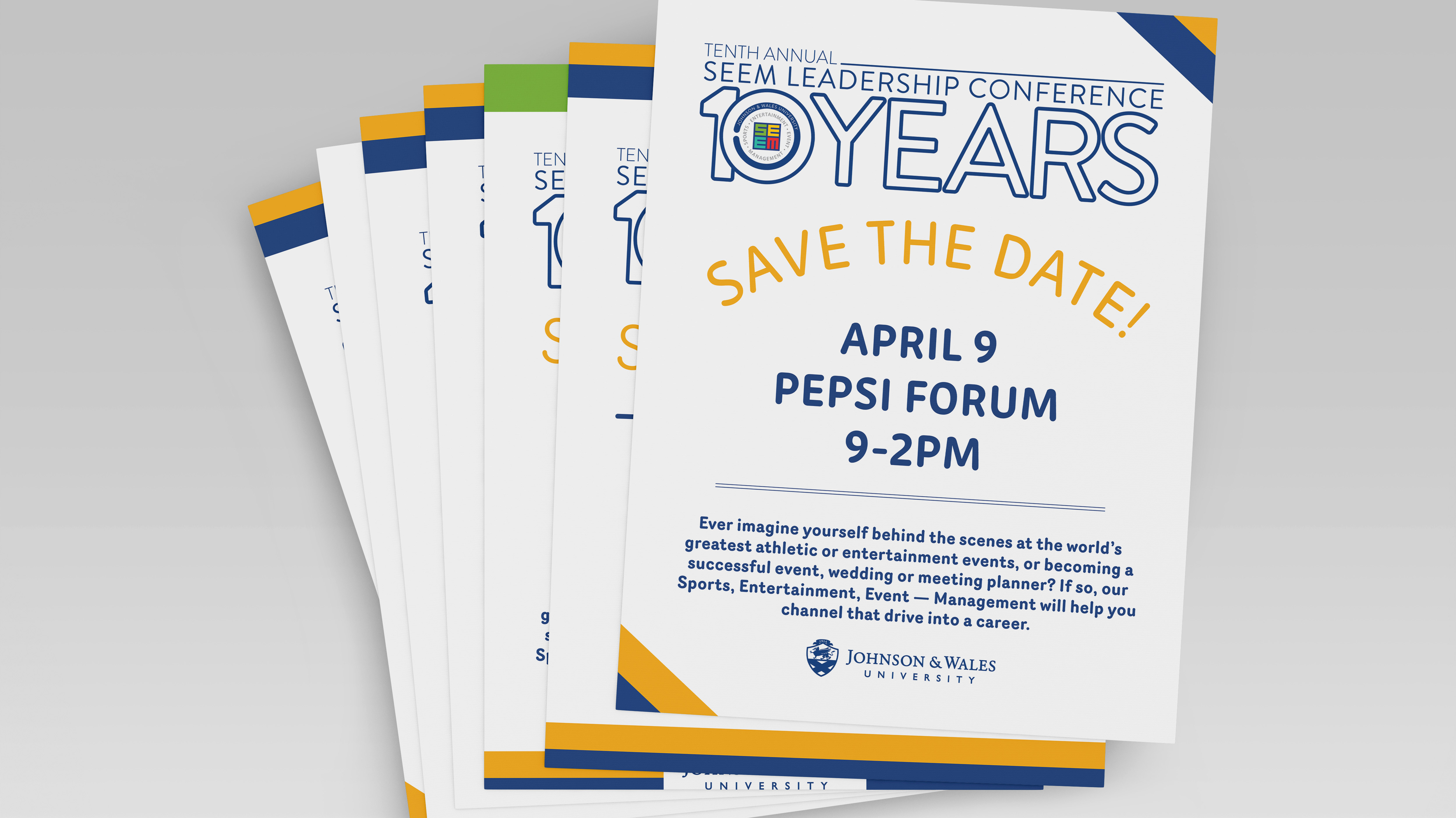
The Better World of Design was an assignment for the Editorial and Publication Design class where we were tasked to create a flyer for an upcoming JWU event.
There are different ways to express design, which is why I chose the Memphis Group for this particular project. The Memphis Group has such a distinct style that can symbolize design because of its bright colors and various shapes like circles, triangles, and squares, which are all used in art. The typography chosen for the title also complements the shapes because the letters themselves are geometric and have personality. For the cover, photos of the Bowen Building where graphic design takes place are used to show the viewer that it is a JWU event. The photos are without color to draw attention to the pink bright background. On the back of the flier, there are two sections contained with information and descriptions that were given to us and required to be added onto, and as you can see, the same background pattern is consistent.
